

NRF Booth Design: What the Three-Second Rule Actually Means for Your Floor Plan
The "three-second rule" isn't a measured statistic — it's an industry shorthand for a real condition: on a floor as dense as NRF's, a booth has to communicate what it does before someone reads a paragraph of copy. Four things determine whether it does: clarity (can a passerby tell what you do at a glance), energy (does something look like it's actually happening), access (can someone walk in without navigating around furniture or a reception desk), and credibility (does the booth look like it can back up what it claims). NRF's floor also isn't one undifferentiated mass — it's split into the main halls plus specialized zones like the Startup Hub and AI Stage, so part of designing well is knowing which part of the floor you're actually competing on.
At NRF 2027, your booth has a brief window to communicate what you do before someone in the aisle decides to keep walking. That's what good NRF booth design actually optimizes for: a headline that reads at a glance, a demo placed where the aisle can see it, and an entry with nothing blocking the way in. The exhibit industry has a name for that window — the "three-second rule" — and it's worth being upfront about what that phrase is and isn't: a widely used design heuristic, not a number from a measured study. Nobody has published research clocking attendee decisions at exactly three seconds.
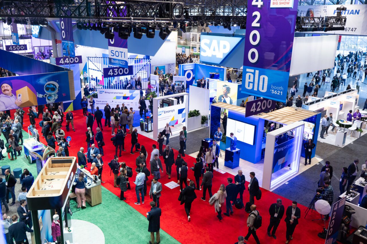
What doesn't need a stopwatch to prove it is the underlying condition. Retail's Big Show puts 1,000+ exhibitors in front of more than 41,000 attendees from over 100 countries, spread across a floor that includes the main exhibit halls plus dedicated zones — the NRF Innovators Showcase, the Startup Hub, an AI Stage, a Reverse Logistics Pavilion, and a Foodservice Innovation Zone. Whatever the real decision window is, it's short, because there's an enormous amount competing for it at the same time, in the same aisles, over the same three days.
This piece works through what that actually means for NRF booth design, the specific, buildable decisions, not just the framing and it's paired with a companion guide on comparing vetted NRF booth builders, which covers cost, timeline, and Javits Center logistics more broadly.
Why the constraint is real at NRF specifically, even without a precise number
The reason the heuristic holds up on this particular floor isn't abstract. NRF exhibitors are overwhelmingly retail technology, POS, AI, and services companies, competing for the attention of buyers who are walking a floor with well over a thousand other exhibitors trying to do the same thing over the same three days. A retail buyer with a fixed number of hours on the floor and a list of vendors to see isn't reading paragraph-length copy at any booth that wasn't already on their list — they're scanning, and a booth needs to earn a second look before it earns a conversation.
The floor's own structure reinforces this. NRF doesn't run as one uniform hall — it's split into the main halls plus dedicated zones, each with its own competitive dynamic (more on that below). Either way, the competitive density is the actual reason speed matters — not the specific number of seconds attached to it.
The four-part test for whether a booth communicates fast enough
Four questions do most of the work in evaluating whether a booth design holds up under these conditions:
Clarity — Can someone walking past tell what you do without reading a paragraph of signage? If your value proposition requires a sentence longer than a tagline to explain, that sentence needs to live in a conversation with your staff, not on your backwall.
Energy — Is something visibly happening at the booth, or does it look like it's waiting for the show to start? A booth with a live demo running, a screen actually displaying something, or staff actively engaged reads as active. A booth with staff on their phones and a static screen reads as closed, even during show hours.
Access — Can someone walk into the booth without navigating around a reception counter, a merchandising wall, or furniture blocking the entry? Every physical barrier between the aisle and your product is a decision point where someone can choose to keep walking instead.
Credibility — Does the booth's presentation match what it's claiming? A company positioning itself as a serious enterprise vendor with a booth that looks improvised undercuts its own pitch before a conversation starts, regardless of how strong the actual product is.
As a practical rule, scoring weak on two or more of these tends to lose the passerby — not necessarily because the product is weak, but because none of its strength was visible in time to register.
Designing for a segmented floor, not a single one
Because NRF's floor isn't uniform, "design for three seconds" means something different depending on where your booth sits:
If you're in the Startup Hub, you're working in a compressed footprint alongside dozens of other early-stage companies (the prior year's class ran past 70). Clarity does more work here than anywhere else on the floor — a startup that needs a paragraph to explain its category will lose to one that can say what it does in four words and demonstrate it live.
If you're on the main exhibit floor in a standard or larger booth, energy and access carry more weight, since you likely have the space for a real demo area and open sightlines — the risk is under-using that space with a design that still funnels visitors through a narrow entry point.
If you're positioned near the AI Stage or a themed pavilion, credibility becomes the harder test, since attendees walking that section are actively comparing multiple vendors making similar technology claims in quick succession — a generic "AI-powered" claim with nothing tangible to demonstrate reads as noise next to a competitor actually running the thing live.
What this means for your design brief
The four-part test is a way to evaluate a design; it's not itself a set of instructions for building one. Here's where each of those evaluation points usually turns into an actual decision on the floor:
| Design element | Practical decision |
|---|---|
| Backwall messaging | One clear category statement plus one supporting benefit — not a full paragraph explaining the product |
| Demo placement | Position it so it's visible from the aisle, not tucked behind furniture or a counter |
| Reception counter | Place it to the side or rear of the footprint, never directly in the entry path |
| Enclosed meeting rooms | Keep them from dominating the frontage — push them to the back or a side wall |
| Screens | Show the product actually working or its outcome, not a branded animation with no functional content |
| Staff positioning | Keep at least one person visible and available near the open entry, not clustered at the back |
None of this is exotic — it's standard exhibit design discipline, applied specifically to a floor dense enough that skipping any one of these has a real, visible cost. If your product or service is genuinely hard to explain in a glance, the fix isn't more signage text — it's a live, visible demonstration that shows the outcome rather than describing the mechanism. And if you're in a themed zone like the Startup Hub or near the AI Stage, look at what your immediate neighbors are likely doing: the design needs to read as distinct from a cluster of similar pitches, not just clear on its own.
The bottom line for NRF booth design
Whether the real attention window is one second or fifteen doesn't change the underlying math: a floor with well over a thousand exhibitors and a fixed number of walking hours per attendee makes fast, clear communication a design requirement, not a nice-to-have. Treat "three seconds" as shorthand for that requirement, not a measured deadline, and the six decisions above — messaging, demo placement, reception, meeting rooms, screens, and staffing — are where that requirement actually gets built into the booth.
This is also where a builder with real NRF floor experience earns their fee — someone who's built for the Startup Hub, the main floor, and a themed pavilion will design differently for each, rather than applying one booth concept everywhere. If you're scoping your NRF booth now, compare vetted NRF booth builders on Exhibitorly by size, format, and floor-specific design experience — Startup Hub footprint or main-floor island — before you brief a builder who's never worked this show.