

Trade Show Booth Design: A Practical Guide for First-Time Exhibitors
Good trade show booth design is not decoration, it is traffic engineering. This guide covers the three-second rule, how to zone a booth so people can actually enter it, where design budget earns its keep, and a brief template you can hand a builder so quotes come back comparable.
Most first booths fail the same way. They look fine in the rendering, then on the floor nobody stops. That is not a taste problem, it is a design problem, and trade show booth design is closer to traffic engineering than to decoration.
This guide covers what actually determines whether people enter your space: the three-second rule, how to zone a floor, where design money earns its keep, and a brief template that makes builder quotes comparable.
The Three-Second Rule
A visitor walking an aisle at normal pace gives your booth roughly three seconds before deciding to stop or keep moving. Every layout decision follows from that number.
Three seconds is enough for one message, not five. It means one headline in large type, positioned high, saying the single most useful thing about what you do. First-timers routinely try to fit their full product range onto a back wall, and the result reads as noise from ten feet away.
Write your sentence before anything else. If you cannot get it into one line, no amount of booth design will get it across in three seconds.
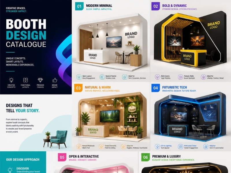
Zone the Floor: Attract, Engage, Close
Even 100 square feet has three functional zones, and confusing them is the most common cause of a quiet booth.
- Attract, front third. Keep it open. This is where people decide to step in. Nothing waist-height or above should sit across the front edge.
- Engage, middle. Demo station, product, or whatever gives a visitor a reason to stay past the first sentence.
- Close, back. Storage, literature, and the space where a real conversation happens without blocking the entrance.
The single most damaging first-timer choice is a counter across the front. It reads as a service desk, and people queue at desks or avoid them, they do not wander into them. Move counters to one side.
Height Is Free, Floor Space Is Not
You pay for square feet. You do not pay for the vertical space above them, and it is the cheapest visibility you will ever buy.
Put your primary message between roughly 7 and 10 feet so it clears the heads of people standing in the aisle. Anything below 4 feet is functionally invisible on a busy floor because bodies block it. Check your show's exhibitor manual before designing, since most US shows cap inline back walls near 8 feet with lower side walls, while islands can often rig much higher.
Where Design Budget Actually Pays
| Element | Typical spend, 10x10 | Impact |
|---|---|---|
| Lit or backlit graphic wall | $2,000-$5,000 | Highest. Changes how everything else reads |
| Flooring | $300-$1,200 | High. Defines your space, keeps staff functional |
| Counter / demo station | $400-$1,500 | Medium. Necessary, rarely a differentiator |
| Premium furniture | $500-$2,000 | Low. Visitors notice it only after they stop |
| Hanging sign (islands) | $3,000-$8,000 | High on islands, not permitted inline |
The ordering matters more than the numbers. Lighting first, flooring second, furniture last. First-timers usually reverse it.
Design Around Your Staff, Not Just Your Product
A booth is a workspace for two or three people for three days. Plan one clear standing position per staffer with a direct sightline to the aisle, and make sure nobody has to stand behind a barrier to do their job.
Two people is right for a 10x10, three or four for a 10x20. Overstaffing a small booth crowds it, and a crowded small booth is one visitors will not enter.
How This Differs From Retail Display Design
Exhibitors coming from a retail background often carry the wrong instincts across. A retail booth design, in Vancouver or anywhere else, works on shoppers already inside a store, browsing at leisure, with minutes of dwell time. Density and detail reward that audience.
A trade show floor gives you seconds, not minutes, and your visitor is walking somewhere else. The same design compressed for a show floor needs larger type, fewer messages, and a far stronger entry invitation. Detail that rewards a browsing shopper becomes clutter at aisle speed.
The One-Page Brief That Makes Quotes Comparable
Quotes for the same booth routinely differ by 30-50%, and much of that gap exists because builders are answering different assumptions. Fix it with one document sent to all three:
- Booth size, show name, and dates
- Your one-sentence message
- Activities that happen in the space, for example one demo plus seated conversations
- Staff count
- Must-haves and hard constraints
- Budget range, stated honestly
- Shipping origin and storage plans after the show
Builders who receive a real brief quote a real booth. Builders who receive "what would you do for a 10x10?" quote whatever is easiest to sell.
Get Three Designs Before You Commit
Exhibitorly matches you with three vetted builders who work from your brief, with free design concepts and no cost to exhibitors. You compare layouts and prices side by side and keep whichever partner fits.
Write the brief, send it to three builders, and give yourself at least 90 days before move-in.